
 Making good decisions is essential in typography — choosing the right typefaces, fonts, sizes, spacing and so on — can have a major impact on the quality of your designs. In this one-of-a-kind workshop, art director, illustrator, and motion graphic designer Angie Taylor introduces you to the essential principles of typography.
After exploring the terminology, history, and anatomy of traditional and computer-based fonts, she brings you all the way up to the present day by looking at how text is formatted in today’s creative applications.
You’ll also learn specific software techniques for creating your own lettering from hand-drawn text, animating text on a path, using operators and effects to customize existing fonts, working with 3D text, and more.
This workshop covers many aspects of typography, from its history and terminology to how it is handled by modern software. The contents of this course include:
Introduction
The Introduction chapter sets the stage for the whole course. Your trainer, Angie Taylor, will introduce some of the typographic concepts that will be covered in the following lessons. She’ll also share the story of what inspired her to become a graphic designer.
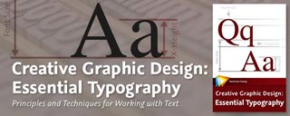
The Essence of Typography
This chapter examines the fundamentals of typography, looking at the history of type and how it influences the terminology we use to describe the anatomy of type.
Typefaces
This chapter focuses on typefaces. It begins by examining the categories of typefaces and then compares some examples from each of the categories so that you are better able to recognize the differences between them. You’ll also discover how certain characteristics and cultural associations can influence the meaning of a particular typeface.
Fonts
Typefaces usually include several fonts with different weights and characteristics. In this chapter you’ll learn about these and the differences and similarities in size, weight, line, and detail that you should be aware of when choosing fonts. We’ll also look at special characters that are included in fonts, such as ligatures.
Spacing
The space between letters, words, and lines of text is just as important as the characters themselves. In this chapter we’ll start thinking of negative space as a shape and look at ways of adjusting this space to balance text correctly.
Formatting Text in Adobe Applications
Most Adobe design and video applications have similar typographic controls. In this chapter we’ll look at the different tools that are available for editing your text and apply some of the concepts we’ve discussed in earlier chapters.
Working with Type in Photoshop
This chapter focuses on the (somewhat limited) text features available Adobe Photoshop. You’ll also learn about some complementary features like layer styles that you can use to personalize your design and add pizzazz to your text.
Working with Type in Illustrator
Illustrator is Angie’s favorite application for designing text, and here’s why. In this chapter you’ll get a ton of creative tips on ways to take a standard, classic font like Helvetica and customize it to get a variety of different looks.
Motion Graphics in Adobe After Effects
In this chapter we’ll focus on creating text for your motion graphic designs. You’ll see how After Effects handles text imported from Photoshop, how to make text move along a specified path, and how to apply effects. We’ll also look at the multitude of text animation presets that you can apply to your text.
The lessons are wrapped in a feature-rich interface that lets you jump to any topic and bookmark individual sections for later review. Full-Screen mode provides a hi-def, immersive experience, and Watch-and-Work mode shrinks the video into a small window so you can play the videos alongside your application. Also included are exercise files that give you an easy way to try out the techniques you learn.
Download a PDf description of this course