Textonomy Presets for Sapphire Edge
 My brand new Textonomy Presets for Sapphire Edge are now available from the Genarts FX Central Website.
OK, sometimes you need text, but no-one says it has to be boring. These ten effect presets, designed for text will have your viewers sitting up and taking notice.
|
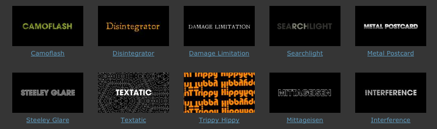
Camoflash A Camouflage-style of pattern is applied to text to give it texture. The Jitter Frames value adjusts the sped of the flashing animation of the texture. Disintegrator Added to text this will have the effect of giving it a slight disintegrated quality. Great for adding a bit of damage to your motion graphics.
Damage Limitation Scratches, stains, dust and shake are added to text to give it a more organic appearance. Perfect for those “”Seven”” inspired film titles. Steeley Glare Adds a textured steel effect to layers. Specifically designed for use on text to add an interesting textured fill. Searchlight This grainy effect plunges your text into semi-darkness and highlights it by adding a searchlight to it. Vignette Centre property is keyframed in the preview movie to make the light move over the text. |
Textatic A groovy, tiling pattern that looks great applied to geometric text. In the preview movie animation is added by keyframing the Inside Rotation property. Trippy Hippy Tiled instances of your text move together in a fluid way to create a groovy movement reminiscent of 60’s dancing. In the preview movie the Zoom property has been keyframes to create additional movement. Mittageisen Designed to add a metallic look to outlined text. Interference Animated scan lines and a dodgy reception effect make your text look slightly damaged. Less than perfect and much more interesting as a result. Metal Postcard A great preset for adding a metallic sheen to your text layers. Who’d have thought you could use a half-tone effect for that! |